
Oslo Art District - Kunst i Kvadraturen
Evolution 2.0
– Oslo Art District’s visual identity must be flexible enough to be able to accommodate all the different art forms, as well as conveying Oslo Art District with a strong identity on its own.
Art is not static. It is constantly changing. This also applies to the institutions that Oslo Art District represents. 12 art galleries/organisations, each of which has long histories, traditions and strong identities, represent art in all its forms from traditional paintings, contemporary conceptual art and photography to textile, sculpture, architecture, photography and drawing.
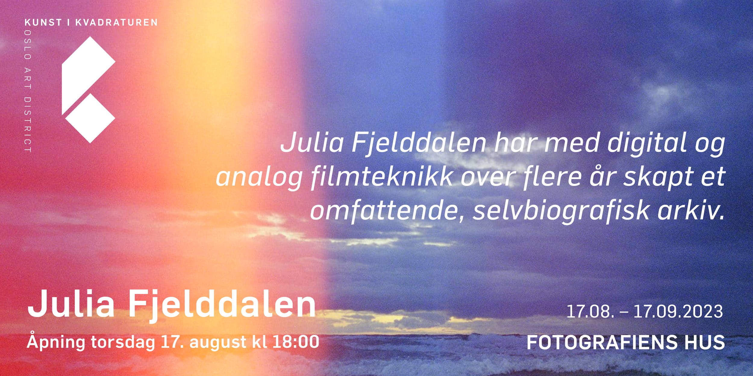
The original logo, designed in 2014, is inspired by the square blocks of the Art District – or Kvadraturen – in Oslo. The letter K emerges in the overlapping streets, placed inside a square (kvadrat in Norwegian). By deconstructing the forms and shapes of the logo, allowing even the symbol itself to undergo change and development, the Evolution 2.0 opens up for a more versatile and flexible use of the elements, still maintaining the strong identity that represents an art district constantly changing and evolving. The symbol retains the conceptual idea, and reinforces the idea of Oslo Art District as a collaborative network where all the parts make up a larger whole. A window, - a peek-a-boo - where new artistry is presented - and discovered.


